Visualization with
ggplot2
Part 2
Good visualization is a critical step in data analysis.
This is the second module in the Visualization and EDA topic. Note that the slides and Other Materials / Extra Reading is the same as in Visualization Pt 1.
Overview
Learning Objectives
Create effective graphics using ggplot and implement best practices for effective graphical communication.
Video Lecture
Example
I’ll create a new .Rmd for this example, and include it in the Git
repo / directory for the Visualization and EDA topic.
I’m also going to take advantage of features in the
tidyverse and patchwork packages, so I’ll load
those next.
library(tidyverse)
## ── Attaching core tidyverse packages ──────────────────────── tidyverse 2.0.0 ──
## ✔ dplyr     1.1.3     ✔ readr     2.1.4
## ✔ forcats   1.0.0     ✔ stringr   1.5.0
## ✔ ggplot2   3.4.3     ✔ tibble    3.2.1
## ✔ lubridate 1.9.2     ✔ tidyr     1.3.0
## ✔ purrr     1.0.2
## ── Conflicts ────────────────────────────────────────── tidyverse_conflicts() ──
## ✖ dplyr::filter() masks stats::filter()
## ✖ dplyr::lag()    masks stats::lag()
## ℹ Use the conflicted package (<http://conflicted.r-lib.org/>) to force all conflicts to become errors
library(patchwork)
We’ll still work with NOAA weather data, which is loaded using the same code as in Visualization Pt 1.
weather_df =
  rnoaa::meteo_pull_monitors(
    c("USW00094728", "USW00022534", "USS0023B17S"),
    var = c("PRCP", "TMIN", "TMAX"),
    date_min = "2021-01-01",
    date_max = "2023-12-31") |>
  mutate(
    name = recode(
      id,
      USW00094728 = "CentralPark_NY",
      USW00022534 = "Molokai_HI",
      USS0023B17S = "Waterhole_WA"),
    tmin = tmin / 10,
    tmax = tmax / 10) |>
  select(name, id, everything())
## Registered S3 method overwritten by 'hoardr':
##   method           from
##   print.cache_info httr
## using cached file: /Users/jeffgoldsmith/Library/Caches/org.R-project.R/R/rnoaa/noaa_ghcnd/USW00094728.dly
## date created (size, mb): 2023-09-19 15:41:55.07359 (8.524)
## file min/max dates: 1869-01-01 / 2023-09-30
## using cached file: /Users/jeffgoldsmith/Library/Caches/org.R-project.R/R/rnoaa/noaa_ghcnd/USW00022534.dly
## date created (size, mb): 2023-09-25 10:06:23.827176 (3.83)
## file min/max dates: 1949-10-01 / 2023-09-30
## using cached file: /Users/jeffgoldsmith/Library/Caches/org.R-project.R/R/rnoaa/noaa_ghcnd/USS0023B17S.dly
## date created (size, mb): 2023-09-19 15:42:03.139582 (0.994)
## file min/max dates: 1999-09-01 / 2023-09-30

weather_df
## # A tibble: 3,009 × 6
##    name           id          date        prcp  tmax  tmin
##    <chr>          <chr>       <date>     <dbl> <dbl> <dbl>
##  1 CentralPark_NY USW00094728 2021-01-01   157   4.4   0.6
##  2 CentralPark_NY USW00094728 2021-01-02    13  10.6   2.2
##  3 CentralPark_NY USW00094728 2021-01-03    56   3.3   1.1
##  4 CentralPark_NY USW00094728 2021-01-04     5   6.1   1.7
##  5 CentralPark_NY USW00094728 2021-01-05     0   5.6   2.2
##  6 CentralPark_NY USW00094728 2021-01-06     0   5     1.1
##  7 CentralPark_NY USW00094728 2021-01-07     0   5    -1
##  8 CentralPark_NY USW00094728 2021-01-08     0   2.8  -2.7
##  9 CentralPark_NY USW00094728 2021-01-09     0   2.8  -4.3
## 10 CentralPark_NY USW00094728 2021-01-10     0   5    -1.6
## # ℹ 2,999 more rows
As a starting point, let’s revisit the scatterplot of
tmax against tmin made in Visualization Pt 1.
weather_df |>
  ggplot(aes(x = tmin, y = tmax)) +
  geom_point(aes(color = name), alpha = .5)
## Warning: Removed 51 rows containing missing values (`geom_point()`).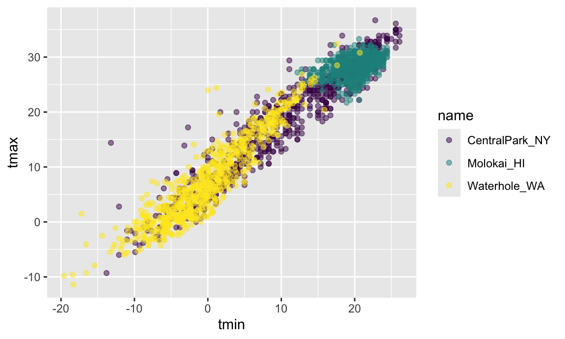
Labels
There are a variety of useful ways to change the appearance of your
plot, especially if your graphic is intended to be viewed by others. One
of the most important things you can do is provide informative axis
labels, plot titles, and captions, all of which can be controlled using
labs().
weather_df |>
  ggplot(aes(x = tmin, y = tmax)) +
  geom_point(aes(color = name), alpha = .5) +
  labs(
    title = "Temperature plot",
    x = "Minimum daily temperature (C)",
    y = "Maxiumum daily temperature (C)",
    color = "Location",
    caption = "Data from the rnoaa package"
  )
## Warning: Removed 51 rows containing missing values (`geom_point()`).
Scales
Aesthetic mappings determine which variables map to which plot attributes. These mappings have reasonable default behaviors, but can be modified through scales.
For example, you’ll occasionally want control over the location and
specification of tick marks on the X or Y axis. These can be manipulated
in scale_x_* and scale_y_* where
* depends on the type of variable mapped to the
x and y aesthetics
(i.e. continuous vs discrete).
weather_df |>
  ggplot(aes(x = tmin, y = tmax)) +
  geom_point(aes(color = name), alpha = .5) +
  labs(
    title = "Temperature plot",
    x = "Minimum daily temperature (C)",
    y = "Maxiumum daily temperature (C)",
    color = "Location",
    caption = "Data from the rnoaa package") +
  scale_x_continuous(
    breaks = c(-15, 0, 15),
    labels = c("-15º C", "0", "15"))
## Warning: Removed 51 rows containing missing values (`geom_point()`).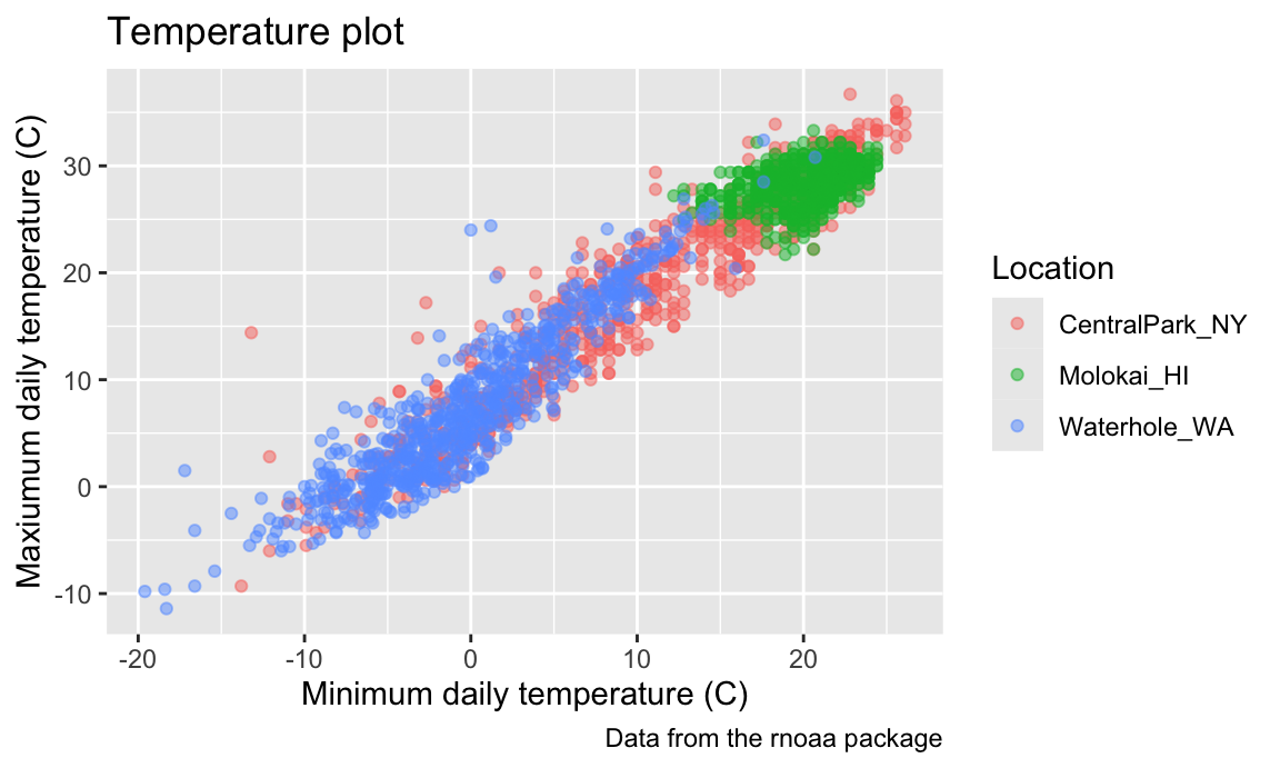
There are a variety of other scale_x_* and
scale_y_* options – it can be helpful to know how and where
these are controlled, although I usually would have to google how to do
what I want.
weather_df |>
  ggplot(aes(x = tmin, y = tmax)) +
  geom_point(aes(color = name), alpha = .5) +
  labs(
    title = "Temperature plot",
    x = "Minimum daily temperature (C)",
    y = "Maxiumum daily temperature (C)",
    color = "Location",
    caption = "Data from the rnoaa package") +
  scale_x_continuous(
    breaks = c(-15, 0, 15),
    labels = c("-15ºC", "0", "15"),
    limits = c(-20, 30)) +
  scale_y_continuous(
    trans = "sqrt",
    position = "right")
## Warning in self$trans$transform(x): NaNs produced
## Warning: Transformation introduced infinite values in continuous y-axis
## Warning: Removed 217 rows containing missing values (`geom_point()`).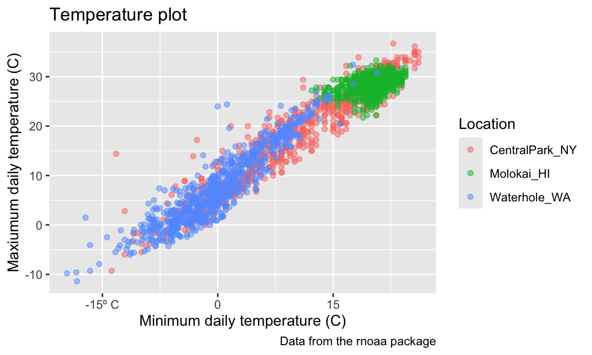
For many graph options there are several ways to produce the desired
result, and you should feel free to use whichever is most convenient.
For instance, scale_y_sqrt() can be added to a
ggplot object to transform the Y scale, and
xlim() can be used to control the plot limits in the X
axis.
Analogously to scale_x_* and scale_y_*,
there are scales corresponding to other aesthetics. Some of
the most common are used to control the color aesthetic.
For example, arguments to scale_color_hue() control the
color scale and the name in the plot legend.
weather_df |>
  ggplot(aes(x = tmin, y = tmax)) +
  geom_point(aes(color = name), alpha = .5) +
  labs(
    title = "Temperature plot",
    x = "Minimum daily temperature (C)",
    y = "Maxiumum daily temperature (C)",
    color = "Location",
    caption = "Data from the rnoaa package") +
  scale_color_hue(h = c(100, 300))
## Warning: Removed 51 rows containing missing values (`geom_point()`).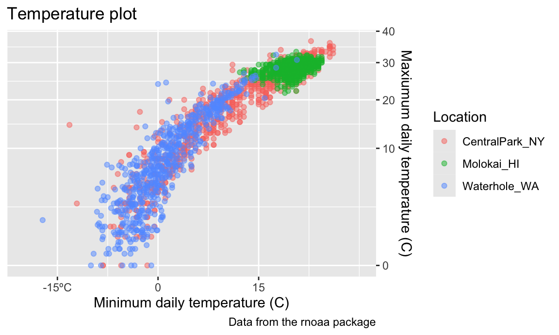
Trying to create your own color scheme usually doesn’t go well; I
encourage you to use the viridis
package instead. There are several options, but the default color scheme
works nicely!
ggp_temp_plot =
  weather_df |>
  ggplot(aes(x = tmin, y = tmax)) +
  geom_point(aes(color = name), alpha = .5) +
  labs(
    title = "Temperature plot",
    x = "Minimum daily temperature (C)",
    y = "Maxiumum daily temperature (C)",
    color = "Location",
    caption = "Data from the rnoaa package"
  ) +
  viridis::scale_color_viridis(
    name = "Location",
    discrete = TRUE
  )

ggp_temp_plot
## Warning: Removed 51 rows containing missing values (`geom_point()`).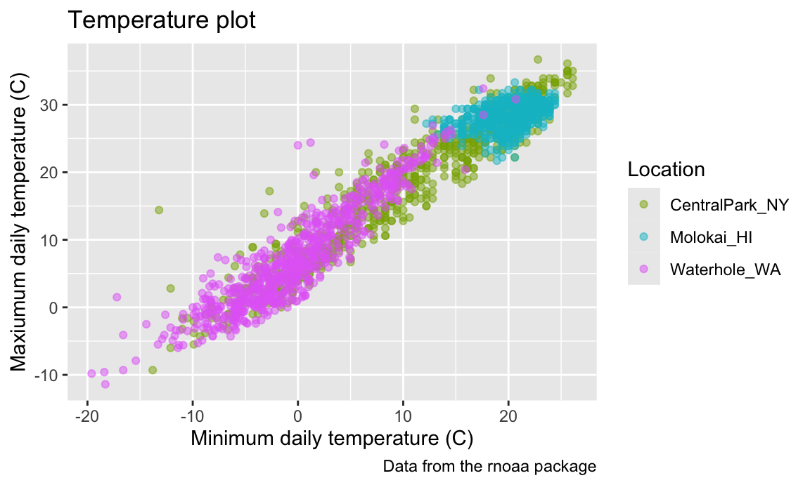
We used discrete = TRUE because the color
aesthetic is mapped to a discrete variable. In other cases (for example,
when color mapped to prcp) you can omit this argument to
get a continuous color gradient. The
viridis::scale_fill_viridis() function is appropriate for
the fill aesthetic used in histograms, density plots, and
elsewhere.
Themes
Themes are used to modify non-data elements of a plot – they don’t change mappings or how data are render, but control things like background color and location of the the legend. Using themes can help with general plot appearance.
For example, I frequently change is the legend position. By default this is on the right of the graphic, but I like to shift it to the bottom to ensure the graphic takes up the available left-to-right space.
ggp_temp_plot +
  theme(legend.position = "bottom")
## Warning: Removed 51 rows containing missing values (`geom_point()`).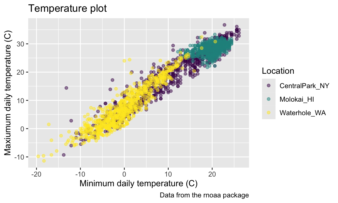
Quick tip: legend.position = "none" will remove the
legend. This is helpful when multiple plots use the same color scheme or
when the legend is obnoxious for some other reason.
While you can manage specific theme elements individually, I
recommend using a built-in theme. By default this is
theme_gray; here’s theme_bw():
ggp_temp_plot +
  theme_bw() +
  theme(legend.position = "bottom")
## Warning: Removed 51 rows containing missing values (`geom_point()`).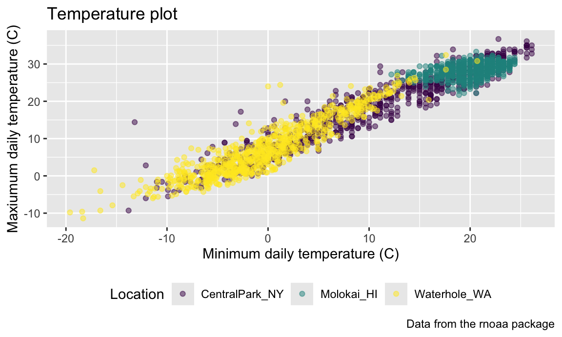
… and here’s theme_classic():
ggp_temp_plot +
  theme_classic() +
  theme(legend.position = "bottom")
## Warning: Removed 51 rows containing missing values (`geom_point()`).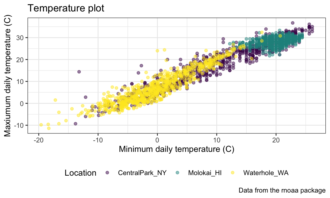
… and, for some reason, here’s the Excel 2003 theme from ggthemes:
ggp_temp_plot +
  ggthemes::theme_excel() +
  theme(legend.position = "bottom")
## Warning: Removed 51 rows containing missing values (`geom_point()`).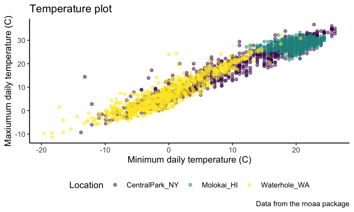
Don’t use the Excel 2003 theme (the first two are fine, and
ggthemes has other very nice themes as well).
The ordering of theme_bw() and theme()
matters – theme() changes a particular element of the
plot’s current “theme”. If you call theme to change the
some element and then theme_bw(), the changes introduced by
theme() are overwritten by theme_bw().
Learning Assessment: Revisit the plot
showing tmax against date for each location.
Use labels, scale options, and theme changes to improve the readability
of this plot.
Solution
One possible plot is shown below.
ggplot(weather_df, aes(x = date, y = tmax, color = name)) +
  geom_smooth(se = FALSE) +
  geom_point(aes(size = prcp), alpha = .75) +
  labs(
    title = "Temperature plot",
    x = "Date",
    y = "Maxiumum daily temperature (C)",
    color = "Location",
    caption = "Data from the rnoaa package"
  ) +
  viridis::scale_color_viridis(discrete = TRUE) +
  theme_minimal() +
  theme(legend.position = "bottom")
## `geom_smooth()` using method = 'gam' and formula = 'y ~ s(x, bs = "cs")'
## Warning: Removed 51 rows containing non-finite values (`stat_smooth()`).
## Warning: Removed 54 rows containing missing values (`geom_point()`).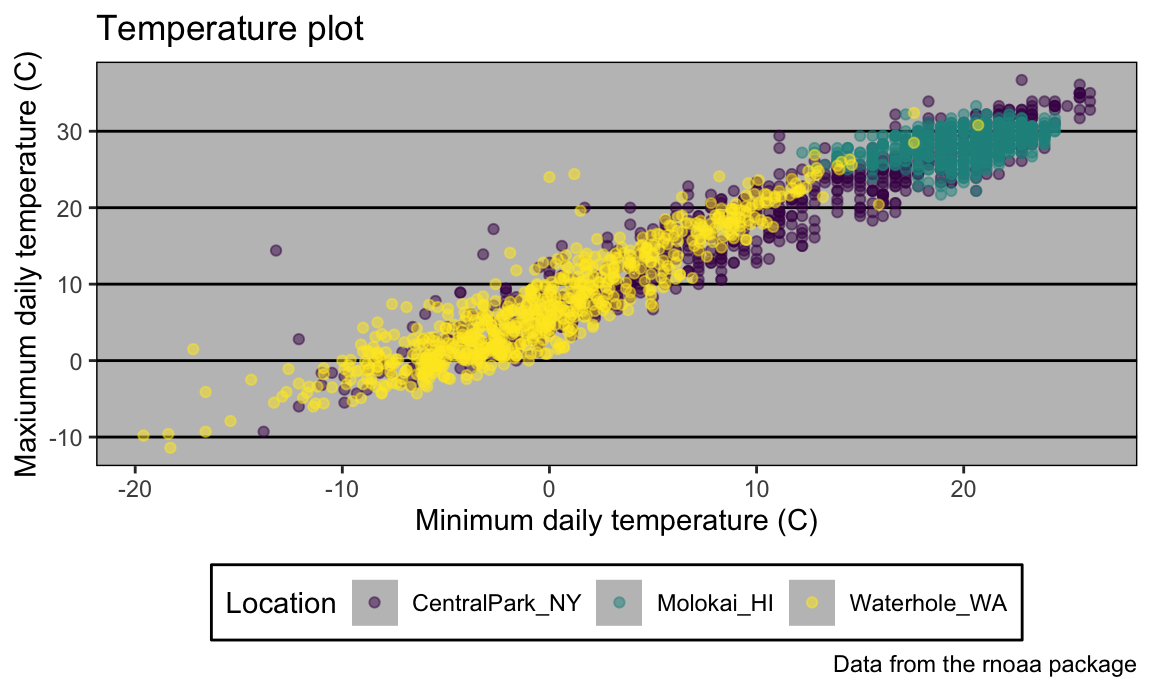
Setting options
In addition to figure sizing, I include a few other figure preferences in global options declared at the outset of each .Rmd file (this code chunk just gets copy-and-pasted to the beginning of every new file).
library(tidyverse)

knitr::opts_chunk$set(
  fig.width = 6,
  fig.asp = .6,
  out.width = "90%"
)

theme_set(theme_minimal() + theme(legend.position = "bottom"))

options(
  ggplot2.continuous.colour = "viridis",
  ggplot2.continuous.fill = "viridis"
)

scale_colour_discrete = scale_colour_viridis_d
scale_fill_discrete = scale_fill_viridis_d
There are ways to set color preferences globally as well (for
example, to use viridis color palettes everywhere, all the
time, without setting these options in your RMarkdown file), although
they’re a bit more involved.
Data argument in geom_*
We’ve seen that where an aesthetic gets mapped to a variable matters
– setting aes(color = name) in ggplot can
yield different results than the same setting in
geom_point(). This arises from the way that
ggplot objects inherit aesthetic mappings, and it turns out
there’s a similar thing with the data used to make a plot.
In a contrived example, we can split weather_df into
separate datasets for Central Park and Molokai Then we use one in the
ggplot() call and another in geom_line():
central_park_df =
  weather_df |>
  filter(name == "CentralPark_NY")

molokai_df =
  weather_df |>
  filter(name == "Molokai_HI")

ggplot(data = molokai_df, aes(x = date, y = tmax, color = name)) +
  geom_point() +
  geom_line(data = central_park_df)
## Warning: Removed 8 rows containing missing values (`geom_point()`).
## Warning: Removed 13 rows containing missing values (`geom_line()`).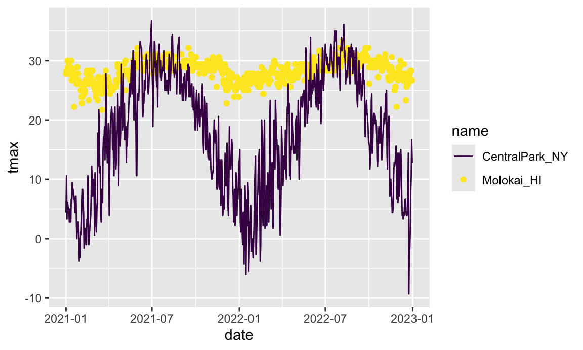
More realistically, it’s sometimes necessary to overlay data
summaries on a plot of the complete data. Depending on the setting, one
way to do this is to create a “summary” dataframe and use that when
adding a new geom to a ggplot based on the
full data.
patchwork
We’ve seen facetting as an approach to create the “same plot” for
several levels of a categorical variable, and this can get you pretty
far. Sometimes, though, you want to show two or three fundamentally
different plots in the same graphic: you may want to juxtapose a
scatterplot and a boxplot, or show scatterplots illustrating
relationships between different variables. In this case, a solution is
to create each of the panels you want separately and combine panels
using tools in the patchwork
package:
tmax_tmin_p =
  weather_df |>
  ggplot(aes(x = tmax, y = tmin, color = name)) +
  geom_point(alpha = .5) +
  theme(legend.position = "none")

prcp_dens_p =
  weather_df |>
  filter(prcp > 0) |>
  ggplot(aes(x = prcp, fill = name)) +
  geom_density(alpha = .5) +
  theme(legend.position = "none")

tmax_date_p =
  weather_df |>
  ggplot(aes(x = date, y = tmax, color = name)) +
  geom_point(alpha = .5) +
  geom_smooth(se = FALSE) +
  theme(legend.position = "bottom")

(tmax_tmin_p + prcp_dens_p) / tmax_date_p
## Warning: Removed 51 rows containing missing values (`geom_point()`).
## `geom_smooth()` using method = 'gam' and formula = 'y ~ s(x, bs = "cs")'
## Warning: Removed 51 rows containing non-finite values (`stat_smooth()`).
## Removed 51 rows containing missing values (`geom_point()`).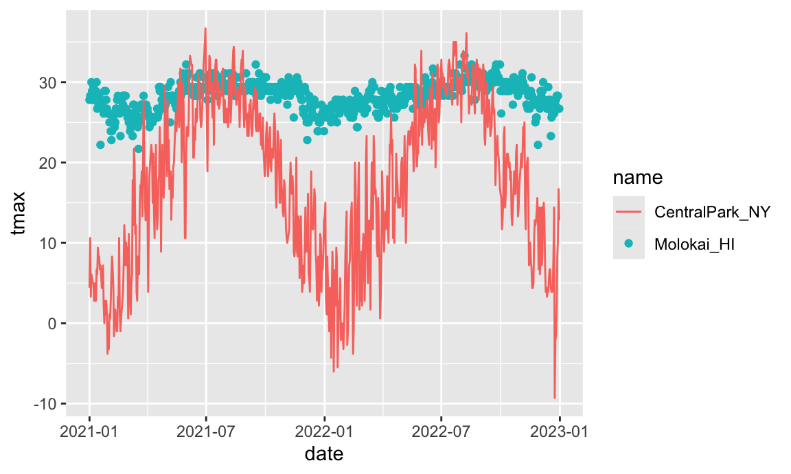
The package is already very helpful but is under active development – some features may change or be added over time – so check the package webstie periodically to stay up-to-date. This does require some amount of work for each panel, and you should keep in mind that this is intended to help combine panels into a plot that couldn’t be created better using data tidying steps.
Data Manipulation
Often, struggles with ggplot are struggles with data
tidying in disguise. Viewing data manipulation as part of the
visualization process will often be your path to success! Put
differently, the behavior of your plot depends on the data you’ve
supplied; in some cases, it’s easier to control behavior through data
manipulation than it is through the plot code.
This is particularly true for the order of categorical or factor
variables in plots. Categorical variables will be ordered
alphabetically; factors will follow the specified order level that
underlies the variable labels. You can change the order level of a
factor variable to your specified preference using
forcats::fct_relevel or according to the value of another
variable using forcats::fct_reorder.
A first example reorders name “by hand”:
weather_df |>
  mutate(name = forcats::fct_relevel(name, c("Molokai_HI", "CentralPark_NY", "Waterhole_WA"))) |>
  ggplot(aes(x = name, y = tmax)) +
  geom_violin(aes(fill = name), color = "blue", alpha = .5) +
  theme(legend.position = "bottom")
## Warning: Removed 51 rows containing non-finite values (`stat_ydensity()`).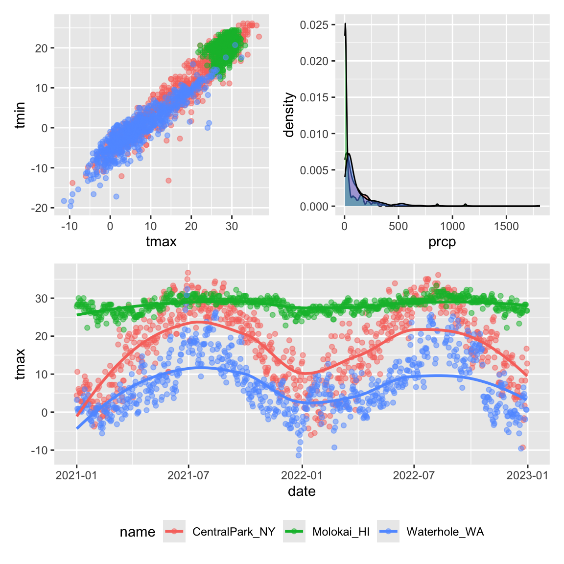
A second example reorders name according to
tmax values in each name:
weather_df |>
  mutate(name = forcats::fct_reorder(name, tmax)) |>
  ggplot(aes(x = name, y = tmax)) +
  geom_violin(aes(fill = name), color = "blue", alpha = .5) +
  theme(legend.position = "bottom")
## Warning: There was 1 warning in `mutate()`.
## ℹ In argument: `name = forcats::fct_reorder(name, tmax)`.
## Caused by warning:
## ! `fct_reorder()` removing 51 missing values.
## ℹ Use `.na_rm = TRUE` to silence this message.
## ℹ Use `.na_rm = FALSE` to preserve NAs.
## Warning: Removed 51 rows containing non-finite values (`stat_ydensity()`).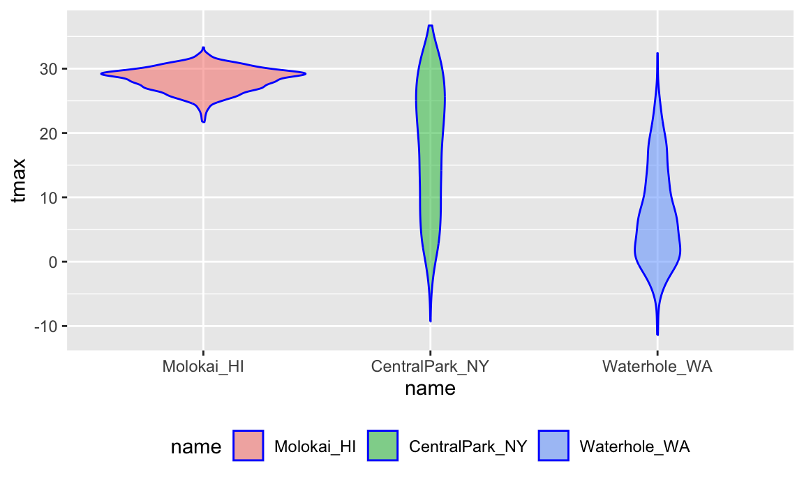
We’ll learn more about the forcats
package in Data Wrangling II.
A more difficult situation relates to data tidyiness. Suppose I
wanted to create a three-panel plot showing densities for
tmax and tmin within each location. More
concretely, I want to be able to facet panels across the
name variable, and create separate densities for
tmax and tmin in each panel. Unfortunately,
weather_df isn’t organized in a way that makes this
easy.
One solution would recognize that tmax and
tmin are separate observation types of a shared
temperature variable. With this understanding, it’s
possible to tidy the weather_df and make the plot
directly:
weather_df |>
  select(name, tmax, tmin) |>
  pivot_longer(
    tmax:tmin,
    names_to = "observation",
    values_to = "temp") |>
  ggplot(aes(x = temp, fill = observation)) +
  geom_density(alpha = .5) +
  facet_grid(~name) +
  viridis::scale_fill_viridis(discrete = TRUE)
## Warning: Removed 102 rows containing non-finite values (`stat_density()`).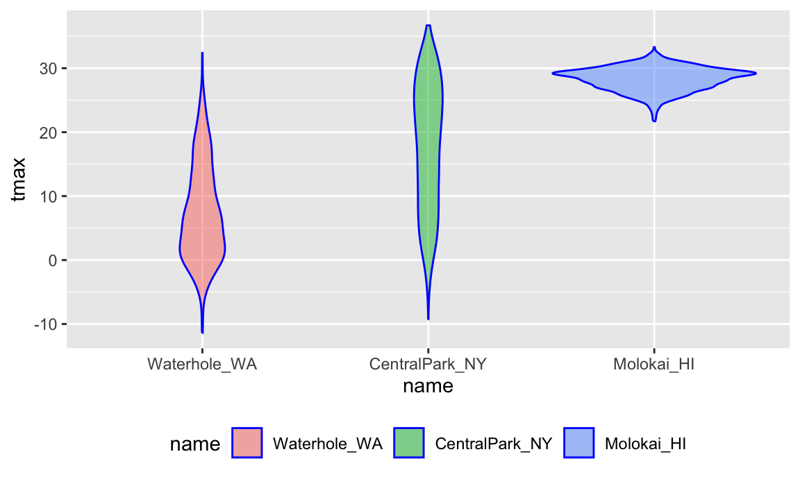
Our emphasis on data tidiness in previous examples is helpful in
visualization. The code below imports and tidies the PULSE data, and
creates a plot showing BDI score across visits. Some steps that are
helpful in retrospect are using pivot_longer to organize
the BDI score and visit time variables, and organizing the visit time
variable into a factor with an informative ordering.
pulse_data =
  haven::read_sas("./data/public_pulse_data.sas7bdat") |>
  janitor::clean_names() |>
  pivot_longer(
    bdi_score_bl:bdi_score_12m,
    names_to = "visit",
    names_prefix = "bdi_score_",
    values_to = "bdi") |>
  select(id, visit, everything()) |>
  mutate(
    visit = recode(visit, "bl" = "00m"),
    visit = factor(visit, levels = str_c(c("00", "01", "06", "12"), "m"))) |>
  arrange(id, visit)

ggplot(pulse_data, aes(x = visit, y = bdi)) +
  geom_boxplot()
## Warning: Removed 879 rows containing non-finite values (`stat_boxplot()`).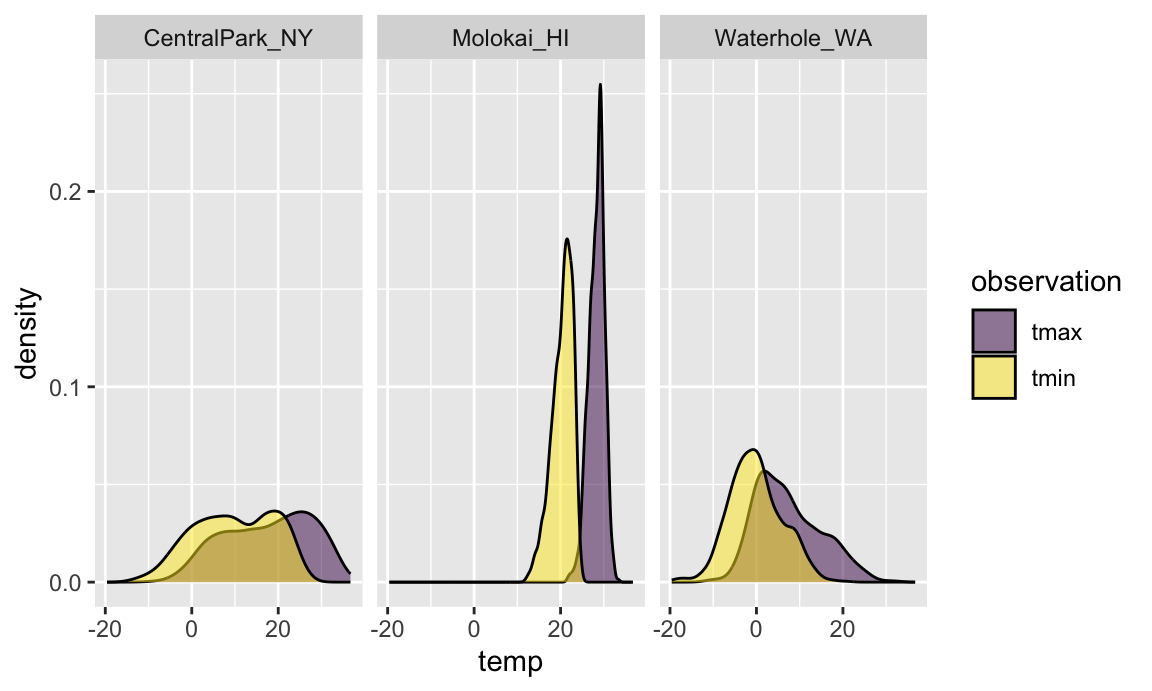
As a final example, we’ll revisit the FAS data. We’ve seen code for data import and organization and for joining the litters and pups data. Here we add some data tidying steps to view pup-level outcomes (post-natal day on which ears “work”, on which the pup can walk, etc) across values of dose category and treatment day.
pup_data =
  read_csv("./data/FAS_pups.csv") |>
  janitor::clean_names() |>
  mutate(
    sex =
      case_match(
        sex,
        1 ~ "male",
        2 ~ "female"))
## Rows: 313 Columns: 6
## ── Column specification ────────────────────────────────────────────────────────
## Delimiter: ","
## chr (1): Litter Number
## dbl (5): Sex, PD ears, PD eyes, PD pivot, PD walk
##
## ℹ Use `spec()` to retrieve the full column specification for this data.
## ℹ Specify the column types or set `show_col_types = FALSE` to quiet this message.

litter_data =
  read_csv("./data/FAS_litters.csv") |>
  janitor::clean_names() |>
  separate(group, into = c("dose", "day_of_tx"), sep = 3)
## Rows: 49 Columns: 8
## ── Column specification ────────────────────────────────────────────────────────
## Delimiter: ","
## chr (2): Group, Litter Number
## dbl (6): GD0 weight, GD18 weight, GD of Birth, Pups born alive, Pups dead @ ...
##
## ℹ Use `spec()` to retrieve the full column specification for this data.
## ℹ Specify the column types or set `show_col_types = FALSE` to quiet this message.

fas_data = left_join(pup_data, litter_data, by = "litter_number")

fas_data |>
  select(sex, dose, day_of_tx, pd_ears:pd_walk) |>
  pivot_longer(
    pd_ears:pd_walk,
    names_to = "outcome",
    values_to = "pn_day") |>
  drop_na() |>
  mutate(outcome = forcats::fct_reorder(outcome, pn_day, median)) |>
  ggplot(aes(x = dose, y = pn_day)) +
  geom_violin() +
  facet_grid(day_of_tx ~ outcome)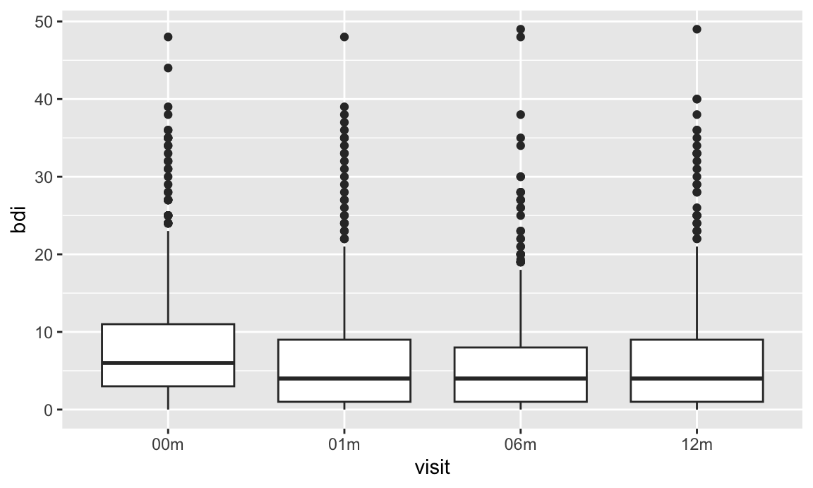
The PULSE and FAS examples involve some fairly complex import, tidying, and plotting steps. They aren’t intended to be daunting, but rather to illustrate how closely linked the steps in this process are and to emphasize the need for proficiency in data wrangling tools when conducting exploratory analyses.
Other materials
Oh man is there a lot of stuff about visualization …
- There are overviews on good and bad graphics
- Including an early paper on “How to display data badly”
- Karl Broman’s top ten worst graphs
- … and Karl’s talk on creating effective figures and table
- Also Hadley Wickham’s paper on the
philosophy underlying
ggplot
- There are tutorials on making graphics using
ggplot- The ggplot2 book
- From R for Data Science: basics and advanced stuff
- Jenny Bryan’s intro to ggplot and her ggplot tutorial (with a video presentation of the ggplot2 tutorial slides)
- From R Programming for Research
- The Graphs chapter in the R Cookbook by Winston Chang
- … and his R Graphics Cookbook
- And, of course, a cheatsheet
- There are arguments about ggplot vs base R graphics
The code that I produced working examples in lecture is here.