Visualization with
ggplot2
Part 1
Good visualization is a critical step in data analysis.
This is the first module in the Visualization and EDA topic.
Overview
Learning Objectives
Create effective graphics using ggplot and implement best practices for effective graphical communication.
Video Lecture
Example
First, I’ll create a GitHub repo + local R project for today’s work
(I’m calling mine viz_and_eda). Occasionally, we’ll use the
same datasets we saw in Data
Wrangling I, so I’ll add sub-directory called data and
put these datasets in
there. Lastly I’ll start an R Markdown file for today, and load the
tidyverse package in “setup” code chunk.
library(tidyverse)
library(ggridges)
We’ll be working with NOAA weather data, which is available in the
p8105.datasets package. (Note: these data were previously
accessed using the rnoaa::meteo_pull_monitors function; due
to changes in NOAA’s API, this package has been discontinued).
library(p8105.datasets)
data("weather_df")
As always, I start by looking at the data; below I’m showing the
result of printing the dataframe in the console, but would also use
view(weather_df) to look around a bit.
weather_df
## # A tibble: 2,190 × 6
##    name           id          date        prcp  tmax  tmin
##    <chr>          <chr>       <date>     <dbl> <dbl> <dbl>
##  1 CentralPark_NY USW00094728 2021-01-01   157   4.4   0.6
##  2 CentralPark_NY USW00094728 2021-01-02    13  10.6   2.2
##  3 CentralPark_NY USW00094728 2021-01-03    56   3.3   1.1
##  4 CentralPark_NY USW00094728 2021-01-04     5   6.1   1.7
##  5 CentralPark_NY USW00094728 2021-01-05     0   5.6   2.2
##  6 CentralPark_NY USW00094728 2021-01-06     0   5     1.1
##  7 CentralPark_NY USW00094728 2021-01-07     0   5    -1
##  8 CentralPark_NY USW00094728 2021-01-08     0   2.8  -2.7
##  9 CentralPark_NY USW00094728 2021-01-09     0   2.8  -4.3
## 10 CentralPark_NY USW00094728 2021-01-10     0   5    -1.6
## # ℹ 2,180 more rows
We’ll start with a basic scatterplot to develop our understanding of
ggplot’s data + mappings + geoms approach, and build
quickly from there.
Basic scatterplot
We’ll use the weather_df data throughout, so we’ll move
straight into defining aesthetic mappings. To create a basic
scatterplot, we need to map variables to the X and Y coordinate
aesthetics:
ggplot(weather_df, aes(x = tmin, y = tmax))
Well, my “scatterplot” is blank. That’s because I’ve defined the data
and the aesthetic mappings, but haven’t added any geoms:
ggplot knows what data I want to plot and how I want to map
variables, but not what I want to show. Below I add a geom
to define my first scatterplot.
ggplot(weather_df, aes(x = tmin, y = tmax)) +
  geom_point()
## Warning: Removed 17 rows containing missing values or values outside the scale range
## (`geom_point()`).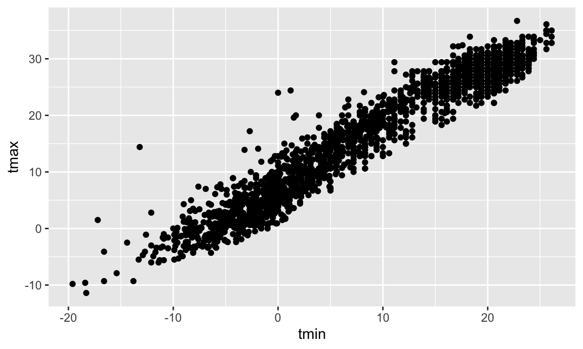
The code below could be used instead to produce the same figure. Using this style can be helpful if you want to do some pre-processing before making your plot but don’t want to save the intermediate data. It’s also consistent with many other pipelines: you start with a data frame, and then do stuff by piping the dataframe into the next function. Most of my plotting code is written like this.
weather_df |>
  ggplot(aes(x = tmin, y = tmax)) +
  geom_point()
Notice that we try to use good styling practices here as well – new plot elements are added on new lines, code that’s part of the same sequence is indented, we’re making use of whitespace, etc.
You can also save the output of ggplot() to an object
and modify / print it later. This is often helpful, although it’s not my
default approach to making plots.
ggp_weather =
  weather_df |>
  ggplot(aes(x = tmin, y = tmax))

ggp_weather + geom_point()
Advanced scatterplot
The basic scatterplot gave some useful information – the variables are related roughly as we’d expect, and there aren’t any obvious outliers to investigate before moving on. We do, however, have other variables to learn about using additional aesthetic mappings.
Let’s start with name, which I can incorporate using the
color aesthetic:
ggplot(weather_df, aes(x = tmin, y = tmax)) +
  geom_point(aes(color = name))
## Warning: Removed 17 rows containing missing values or values outside the scale range
## (`geom_point()`).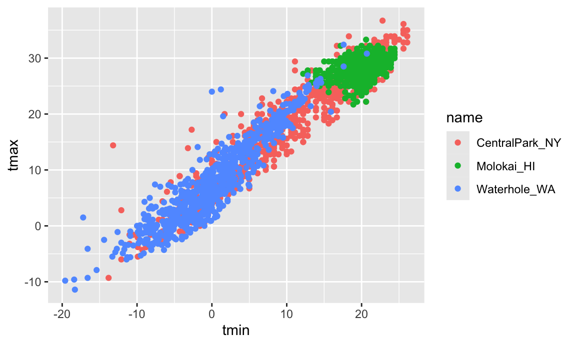
Nice! We get colors and have a handly legend. Maybe next I’ll add a smooth curve and make the data points a bit transparent.
ggplot(weather_df, aes(x = tmin, y = tmax)) +
  geom_point(aes(color = name), alpha = .5) +
  geom_smooth(se = FALSE)
## `geom_smooth()` using method = 'gam' and formula = 'y ~ s(x, bs = "cs")'
## Warning: Removed 17 rows containing non-finite outside the scale range
## (`stat_smooth()`).
## Warning: Removed 17 rows containing missing values or values outside the scale range
## (`geom_point()`).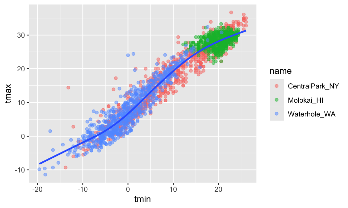
Neat! The curve gives a sense of the relationship between variables, and the transparency shows where data are overlapping. I can’t help but notice, though, that the smooth curve is for all the data but the colors are only for the scatterplot. Turns out that this is due to where I defined the mappings. The X and Y mappings apply to the whole graphic, but color is currently geom-specific. Sometimes you want or need to do this, but for now I don’t like it. If I’m honest, I’m also having a hard time seeing everything on one plot, so I’m going to add facet based on name as well.
ggplot(weather_df, aes(x = tmin, y = tmax, color = name)) +
  geom_point(alpha = .5) +
  geom_smooth(se = FALSE) +
  facet_grid(. ~ name)
## `geom_smooth()` using method = 'loess' and formula = 'y ~ x'
## Warning: Removed 17 rows containing non-finite outside the scale range
## (`stat_smooth()`).
## Warning: Removed 17 rows containing missing values or values outside the scale range
## (`geom_point()`).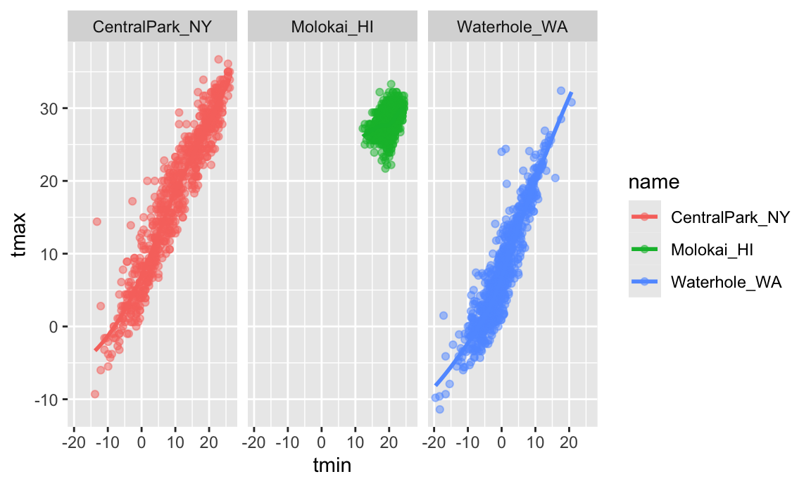
Awesome! I’ve learned a lot about these data. However, the relationship between minimum and maximum temperature is now kinda boring, so I’d prefer something that shows the time of year. Also I want to learn about precipitation, so let’s do that.
ggplot(weather_df, aes(x = date, y = tmax, color = name)) +
  geom_point(aes(size = prcp), alpha = .5) +
  geom_smooth(se = FALSE) +
  facet_grid(. ~ name)
## `geom_smooth()` using method = 'loess' and formula = 'y ~ x'
## Warning: Removed 17 rows containing non-finite outside the scale range
## (`stat_smooth()`).
## Warning: Removed 19 rows containing missing values or values outside the scale range
## (`geom_point()`).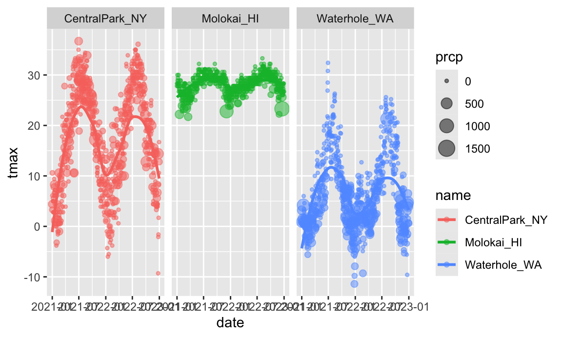
Way more interesting! You get a whole range of temperatures in Central Park (sometimes it’s maybe too hot); it’s more temperate near Seattle but it rains all the time; and Molokai is great except for that a few (relatively) cold, rainy days.
Learning Assessment: Write a code chain
that starts with weather_df; focuses only on Central Park,
converts temperatures to Fahrenheit, makes a scatterplot of min vs. max
temperature, and overlays a linear regression line (using options in
geom_smooth()).
Solution
I can produce the desired plot using the code below:
weather_df |>
  filter(name == "CentralPark_NY") |>
  mutate(
    tmax_fahr = tmax * (9 / 5) + 32,
    tmin_fahr = tmin * (9 / 5) + 32) |>
  ggplot(aes(x = tmin_fahr, y = tmax_fahr)) +
  geom_point(alpha = .5) +
  geom_smooth(method = "lm", se = FALSE)
Looks like there’s a pretty linear relationship between min and max temperatures in Central Park.
Odds and ends
There are lots of ways you can mix and match elements, depending on your goals. I don’t like the following plot as much (it doesn’t show the data and omits precipitation), but it illustrates that you have lots of freedom in determining which geoms to include and how to compare your groups. If nothing else, you should be starting to get a sense for why you create way more plots for yourself than for others.
ggplot(weather_df, aes(x = date, y = tmax, color = name)) +
  geom_smooth(se = FALSE)
## `geom_smooth()` using method = 'loess' and formula = 'y ~ x'
## Warning: Removed 17 rows containing non-finite outside the scale range
## (`stat_smooth()`).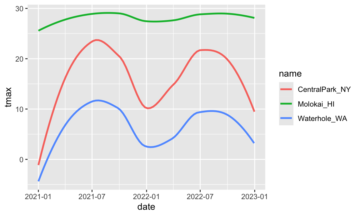
When you’re making a scatterplot with lots of data, there’s a limit
to how much you can avoid overplotting using alpha levels and
transparency. In these cases geom_hex(),
geom_bin2d(), or geom_density2d() can be
handy:
ggplot(weather_df, aes(x = tmax, y = tmin)) +
  geom_hex()
## Warning: Removed 17 rows containing non-finite outside the scale range
## (`stat_binhex()`).
## Warning: Computation failed in `stat_binhex()`.
## Caused by error in `compute_group()`:
## ! The package "hexbin" is required for `stat_bin_hex()`.
There are lots of aesthetics, and these depend to some extent on the
geom – color worked for both geom_point() and
geom_smooth(), but shape only applies to
points. The help page for each geom includes a list of understood
aesthetics.
Learning Assessment: In the preceding, we set the alpha aesthetic “by hand” instead of mapping it to a variable. This is possible for other aesthetics too. To check your understanding of this point, try to explain why the two lines below don’t produce the same result:
ggplot(weather_df) + geom_point(aes(x = tmax, y = tmin), color = "blue")
ggplot(weather_df) + geom_point(aes(x = tmax, y = tmin, color = "blue"))
Solution
In the first attempt, we’re defining the color of the points by hand;
in the second attempt, we’re implicitly creating a color variable that
has the value blue everywhere; ggplot is then
assigning colors according to this variable using the default color
scheme.
Univariate plots
Scatterplots are great, but sometimes you need to carefully understand the distribution of single variables – we’ll tackle that now. This is primarily an issue of learning some new geoms and, where necessary, some new aesthetics.
First up is the histogram.
ggplot(weather_df, aes(x = tmax)) +
  geom_histogram()
## `stat_bin()` using `bins = 30`. Pick better value with `binwidth`.
## Warning: Removed 17 rows containing non-finite outside the scale range
## (`stat_bin()`).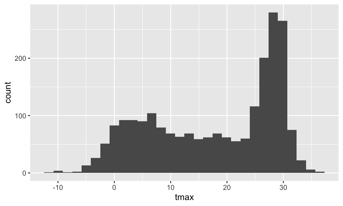
You can play around with things like the bin width and set the fill color using an aesthetic mapping.
ggplot(weather_df, aes(x = tmax, fill = name)) +
  geom_histogram(position = "dodge", binwidth = 2)
## Warning: Removed 17 rows containing non-finite outside the scale range
## (`stat_bin()`).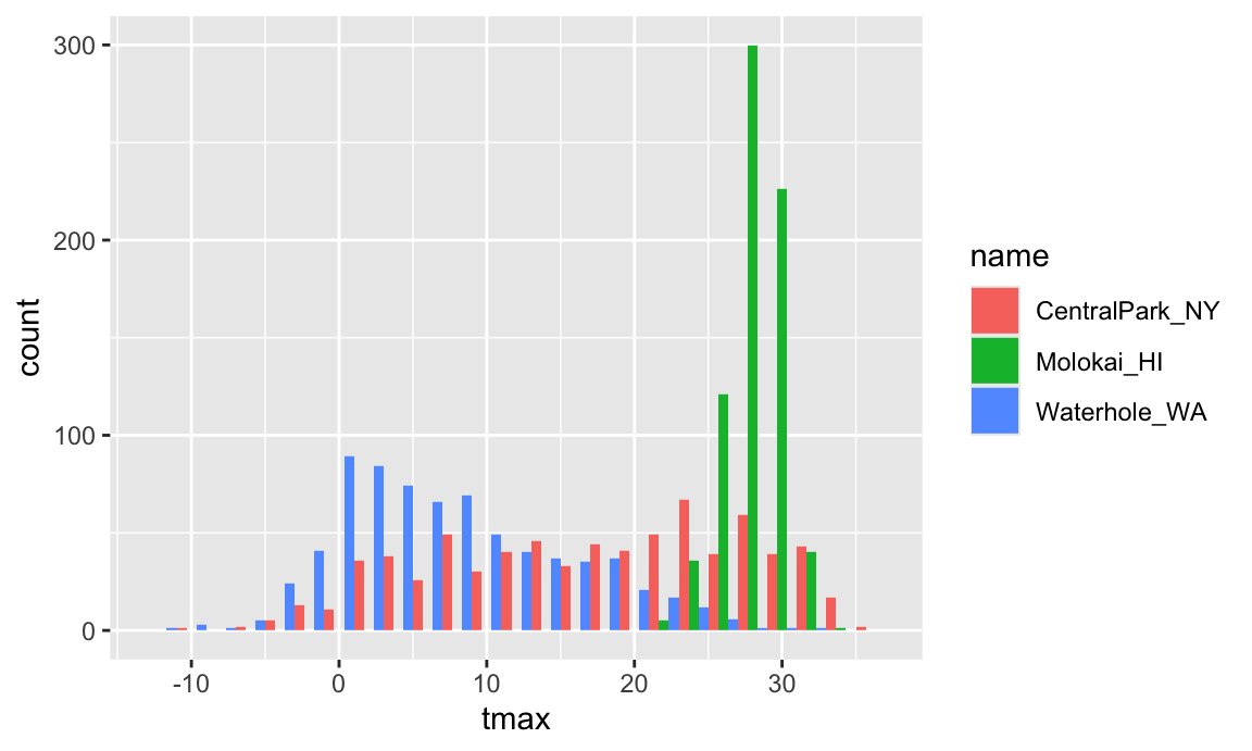
The position = "dodge" places the bars for each group
side-by-side, but this gets sort of hard to understand. I often prefer
density plots in place of histograms.
ggplot(weather_df, aes(x = tmax, fill = name)) +
  geom_density(alpha = .4, adjust = .5, color = "blue")
## Warning: Removed 17 rows containing non-finite outside the scale range
## (`stat_density()`).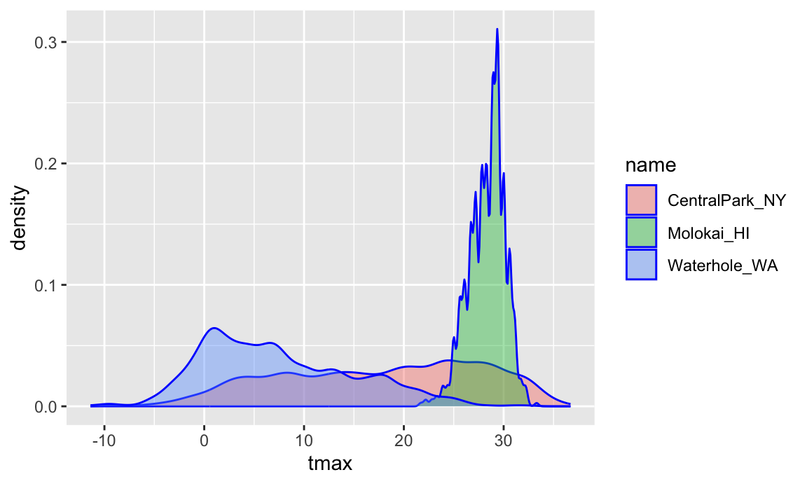
The adjust parameter in density plots is similar to the
binwidth parameter in histograms, and it helps to try a few
values. I set the transparency level to .4 to make sure all densities
appear. You should also note the distinction between fill
and color aesthetics here. You could facet by
name as above but would have to ask if that makes
comparisons easier or harder. Lastly, adding geom_rug() to
a density plot can be a helpful way to show the raw data in addition to
the density.
Histograms and densities are one way of investigating univariate distributions; boxplots are another.
ggplot(weather_df, aes(x = name, y = tmax)) +
  geom_boxplot()
## Warning: Removed 17 rows containing non-finite outside the scale range
## (`stat_boxplot()`).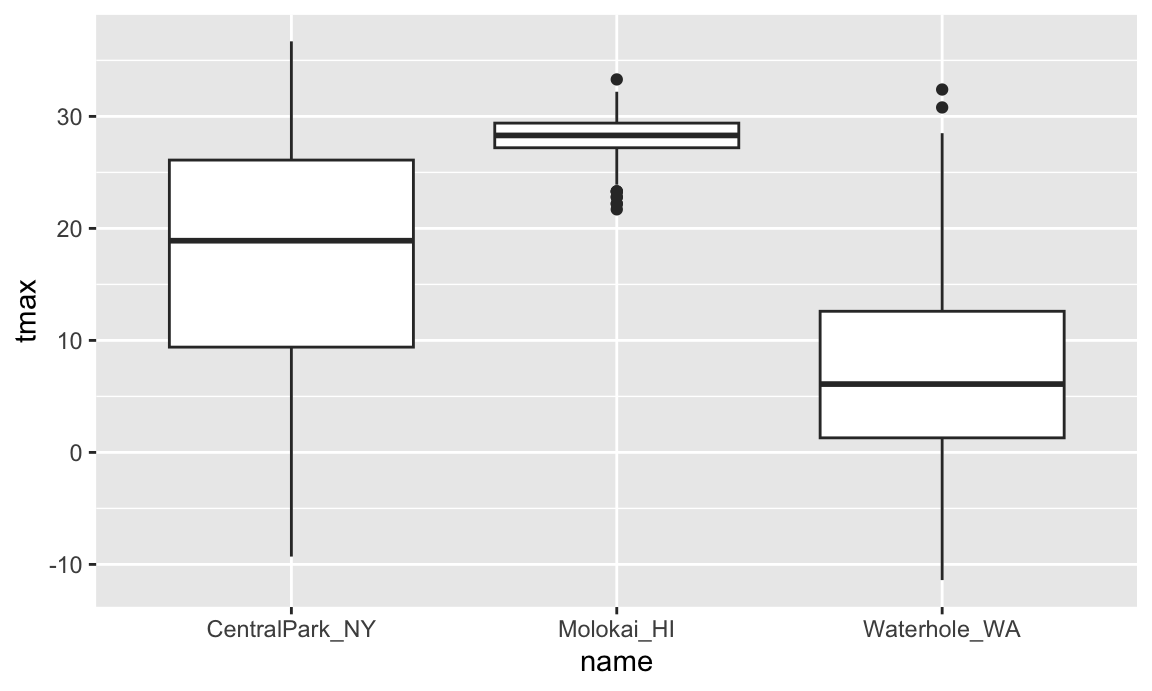
Violin plots are sometimes nice, but folks complain that they don’t look like violins.
ggplot(weather_df, aes(x = name, y = tmax)) +
  geom_violin(aes(fill = name), alpha = .5) +
  stat_summary(fun = "median", color = "blue")
## Warning: Removed 17 rows containing non-finite outside the scale range
## (`stat_ydensity()`).
## Warning: Removed 17 rows containing non-finite outside the scale range
## (`stat_summary()`).
## Warning: Removed 3 rows containing missing values or values outside the scale range
## (`geom_segment()`).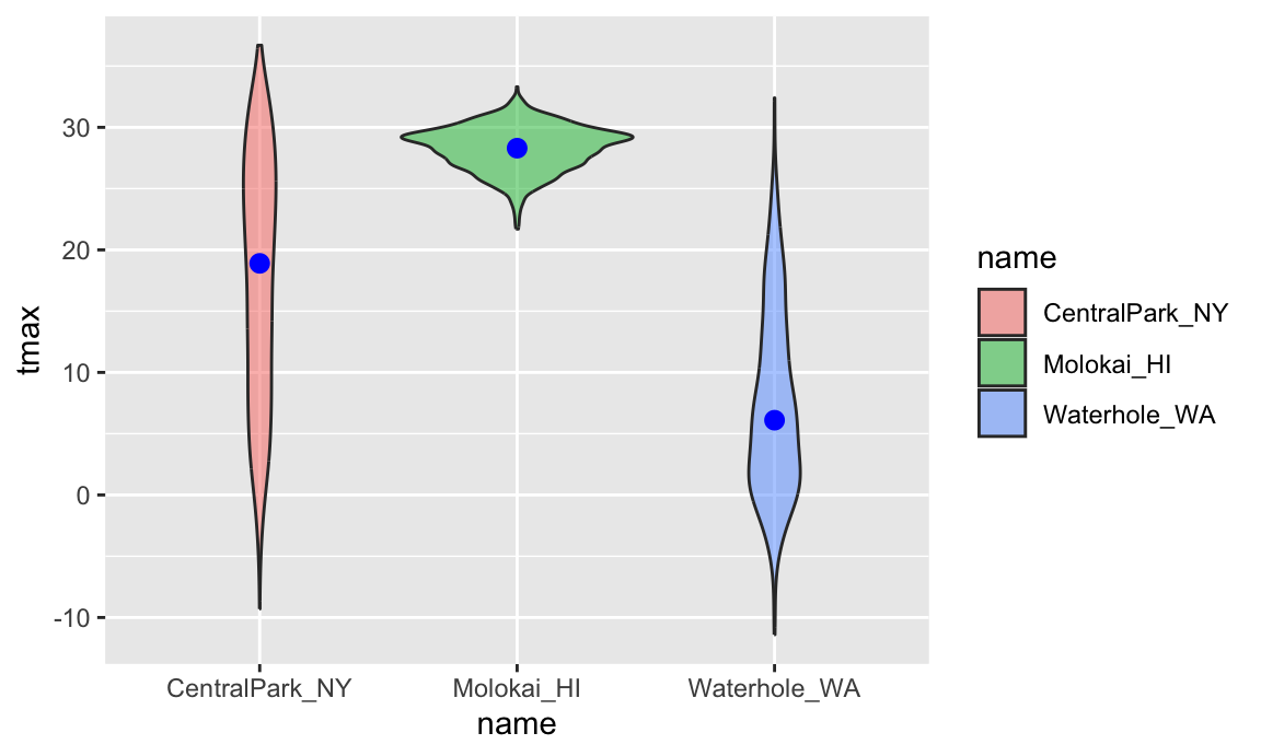
Ridge plots were the trendiest plot of 2017, and were a replacement
for both boxplots and violin plots. They’re implemented in the ggridges
package, and are nice if you have lots of categories in which the shape
of the distribution matters. There are both good
and bad
examples of ridge plots out there …
ggplot(weather_df, aes(x = tmax, y = name)) +
  geom_density_ridges(scale = .85)
## Picking joint bandwidth of 1.54
## Warning: Removed 17 rows containing non-finite outside the scale range
## (`stat_density_ridges()`).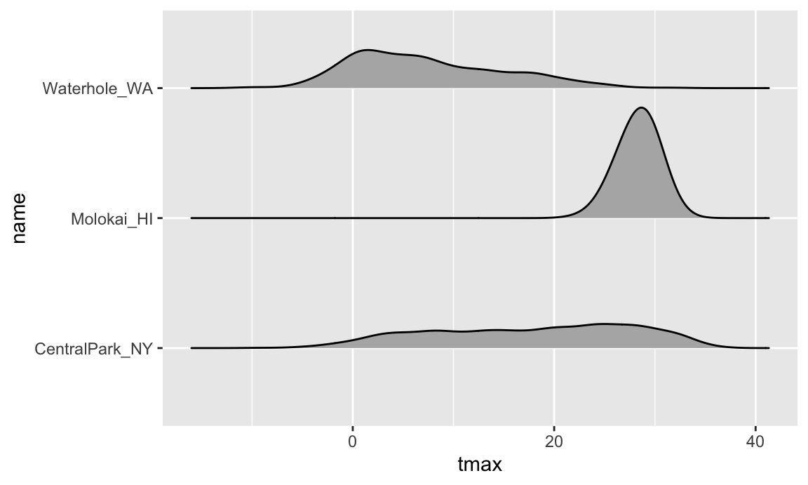
Learning Assessment: Make plots that compare precipitation across locations. Try a histogram, a density plot, a boxplot, a violin plot, and a ridgeplot; use aesthetic mappings to make your figure readable.
Solution
I’ll show a few possibilities, although this is by no means exhaustive!
First a density plot:
ggplot(weather_df, aes(x = prcp)) +
  geom_density(aes(fill = name), alpha = .5)
Next a ridge plot:
ggplot(weather_df, aes(x = prcp, y = name)) +
  geom_density_ridges(scale = .85)
Last a boxplot:
ggplot(weather_df, aes(y = prcp, x = name)) +
  geom_boxplot()
This is a tough variable to plot because of the highly skewed distribution in each location. Of these, I’d probably choose the boxplot because it shows the outliers most clearly. If the “bulk” of the data were interesting, I’d probably compliment this with a plot showing data for all precipitation less than 100, or for a data omitting days with no precipitation.
weather_df |>
  filter(prcp > 0) |>
  ggplot(aes(x = prcp, y = name)) +
  geom_density_ridges(scale = .85)
Saving and embedding plots
You will, on occasion, need to save a plot to a specific file.
Don’t use the built-in “Export” button! If you do, your
figure is not reproducible – no one will know how your plot was
exported. Instead, use ggsave() by explicitly creating the
figure and exporting; ggsave will guess the file type you
prefer and has options for specifying features of the plot. In this
setting, it’s often helpful to save the ggplot object
explicitly and then export it (using relative paths!).
ggp_weather =
  ggplot(weather_df, aes(x = tmin, y = tmax)) +
  geom_point(aes(color = name), alpha = .5)

ggsave("ggp_weather.pdf", ggp_weather, width = 8, height = 5)
Embedding plots in an R Markdown document can also take a while to
get used to, because there are several things to adjust. First is the
size of the figure created by R, which is controlled using two of the
three chunk options fig.width, fig.height, and
fig.asp. I prefer a common width and plots that are a
little wider than they are tall, so I set options to
fig.width = 6 and fig.asp = .6. Second is the
size of the figure inserted into your document, which is controlled
using out.width or out.height. I like to have
a little padding around the sides of my figures, so I set
out.width = "90%". I do all this by including the following
in a code snippet at the outset of my R Markdown documents.
knitr::opts_chunk$set(
  fig.width = 6,
  fig.asp = .6,
  out.width = "90%"
)
What makes embedding figures difficult at first is that things like
the font and point size in the figures generated by R are constant –
that is, they don’t scale with the overall size of the figure. As a
result, text in a figure with width 12 will look smaller than
text in a figure with width 6 after both have been embedded in a
document. As an example, the code chunk below has set
fig.width = 12.
ggplot(weather_df, aes(x = tmin, y = tmax)) +
  geom_point(aes(color = name))
## Warning: Removed 17 rows containing missing values or values outside the scale range
## (`geom_point()`).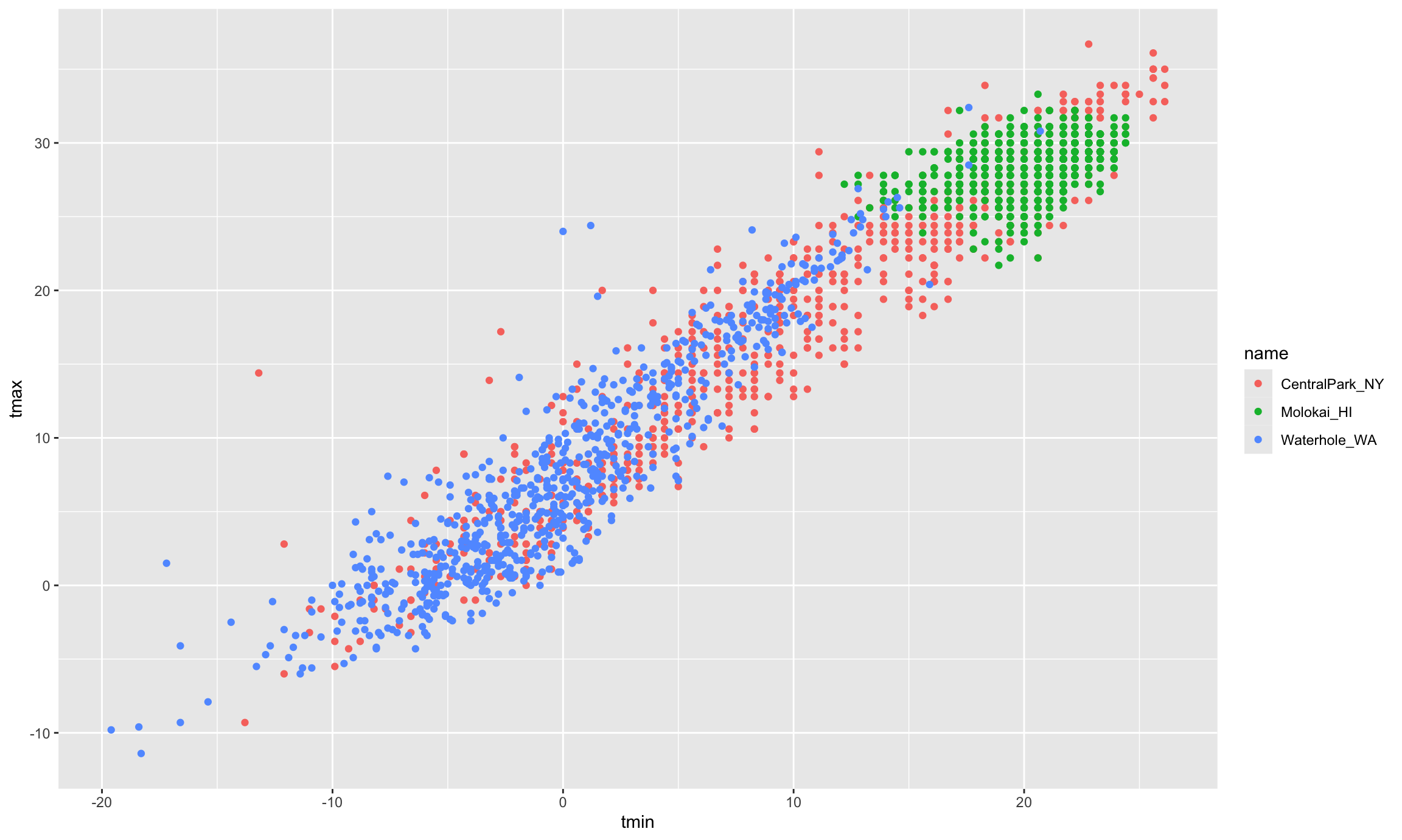
Usually you can get by with setting reasonable defaults, but keep a careful eye on figures you intend to show others – everything should be legible!
Learning Assessment: Set global options for
your figure sizes in the “setup” code chunk and re-knit your document.
What happens when you change fig.asp? What about
out.width?
Other materials
Oh goodness is there a lot of stuff about visualization …
- There are overviews on good and bad graphics
- Including an early paper on “How to display data badly”
- Karl Broman’s top ten worst graphs
- … and Karl’s talk on creating effective figures and table
- Also Hadley Wickham’s paper on the
philosophy underlying
ggplot
- There are tutorials on making graphics using
ggplot- From R for Data Science: basics and advanced stuff
- Jenny Bryan’s ggplot tutorial (with a video presentation of the ggplot2 tutorial slides)
- From R Programming for Research
- The Graphs chapter in the R Cookbook by Winston Chang
- … and his R Graphics Cookbook
- And, of course, a cheatsheet
- There are arguments about ggplot vs base R graphics
The code that I produced working examples in lecture is here.